Sunday 22 November 2009

How to get to sleep when someone is playing loud music


How to get to sleep when someone is playing loud music?
Finals
I think the final products that we created as a group were successful. As this was the first design work we produced it turned out really well. I think it was a good way to get to know each other and understand what people like and don't. I contributed to the concept of the products eg the sleeping pills and scissors because before the group thought we were just going to design a door handle hanger and poster. I also helped develop the logo and produced the tags for the items. Overall i was happy with my commitment to the group.
Tuesday 17 November 2009

Colour

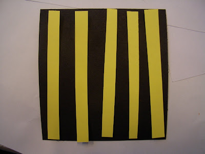
Represents danger. 
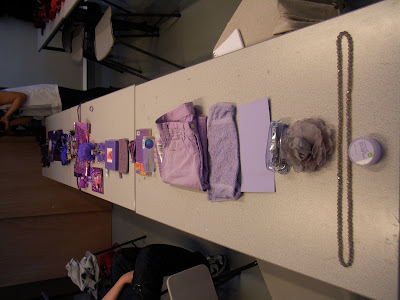
*Primary when with its secondary neutralises.

Colour

Left looks happy. Right secondary colours.

Colour

Colours look fun

Colour

Medical more visible.

Colour

Would trust more for directions stands out more.

Colour

Wouldn't really follow arrow because it is not clear.

Colour

Neutralises because both are secondary colours.

Colour

Yellow is more dominate. 

Colour

Stands out a bit lift each other. The red is more readable because the white is near it. 

Colour

Red not popping as much yellow neutralises Primary together calm each other down and complimentary calms each other down.

Colour

The orange and yellow look darker.

Colour

Information

Colour

Danger

Colour

Doesn't work the same looks mucky and not clear.

Colour

Neutral and legible medical

Colour

The white seems to be whiter than the actual background.

Colour

Black neutralises the colours. 

Colour

Standout. Black doesn't absorb the blue because its a primary so its not mixing as easy.

Colour

On the left the red looks darker and on the right the orange looks warmer.

Colour

Similar neutral colour pretty flat. 

Colour

Black and white neutral

Colour

Black and yellow is flat but yellow and black looks brighter but are the same colours.

Colour

Nothing much happening yellow makes colour bounce.

Colour

Blue and red popping but black neutralises. 

Colour

Yellow stands out more because it is a primary colour. Black neutralises

colour

Yellow starts to stand out, but no fighting. Blue+yellow=green. 

Colour

Blue and green - nothing much seems to be happening.

Colour

The red seems to be popping out on the blue but on the green it is not as bad.

Monday 16 November 2009

Colour


Milk Lid 
was a bit tricky because of the light is being reflected off the colour
but has a strong chromatic value
DE268-1c
c100
m0
y80
k40

Colour


Pantone colour of 
de298-1c
which is:
c40
m0
y100
k0
http://www.pantone.co.uk/pages/pantone/colorfinder.aspx
This item had alot of luminace and quite a low tone

Colour


Plate de304-6c
c15 m0 y90 k40    Pantone
Pantone Challenge- try to match colours of objects to pantone colour guide.
We had to be aware of the luminance off the colour the chromatic value/ saturation and tone. 
The above has a high luminance value.

Colour

Simulated glass shows CMY as the primaries but when overlapped create RGB and as it is a subtractive colour scheme the middle creates black K.It is called Subtractive because the inks subtract brightness from white.
Cyan
Magenta
Yellow
Black

Colour

RGB used for screens. 
The image above shows a representation of additive colour. Projection of three primary colours create secondary colours where the primary's are over lapped. The RGB altogether creates white area. 

Colour


http://www.brainwashed.com/daniel/rgb_index.gif
based upon RGB. 

Colour

Pantone
International colour guide that can be understood in any language/place around the world it is based on figures of CMYK that are put together to create a colour asked for. 

Colour


Colour

We had to arrange all the green items in order from light green to dark green.
This was pretty tricky because some of the items were transparent more saturated than others.

Tuesday 3 November 2009

Dimensions of Colour

Few Notes from 3rd Nov
Dimensions Of a Colour

The range is the dimensions of a colour.
Chromatic Value is how pure the colour is.
The hue is a range of colour.
Each has its own spectrum.
Grey is neutral, no chromatic value.
Luminance is how much light reflects off the colour.
Tint is the movement towards white.
Tone is light going to dullness.
Saturation is how high the chromatic value is.
De saturation is adding more white.

pantone graphics direct

Sunday 1 November 2009

Design Work Duplicate


Idea i had to use a over head projector to finalise my work. As the v-mail had to be blown up to read so would the style I've used as well.

Duplicate Design Sheet

Exploring folds within the word Duplicated. Also looking at what type would work.

Design Development for alphabet


Exploring ideas for Dutch. Design Sheet.